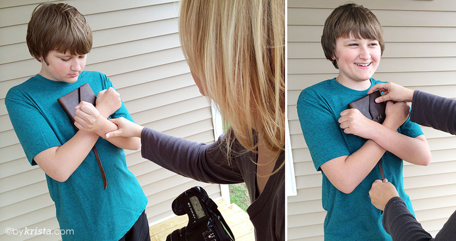
When I started thinking about what I wanted to do for the design of my book cover, I had a very clear vision of what I thought it should look like. Close-up of a teenage boy with his arms crossed over his chest in the sign language for “love”. This is something that the characters do in the book and I thought that would connect the cover with the story. Drew also carries around this worn leather notebook all the time, and I knew I wanted to incorporate that as well.
And shooting my own cover, well, that was no problem with my years of photography experience. So I wrangled Zach, my thirteen year old son, into being my “Drew” for the cover and we shot two sets of pictures. One of him wearing an aqua/teal blue shirt and another wearing a red shirt. Obviously, I went with the blue for the cover, but the leather of the journal looked pretty nice next to the red shirt, so you just never know until you shoot it.
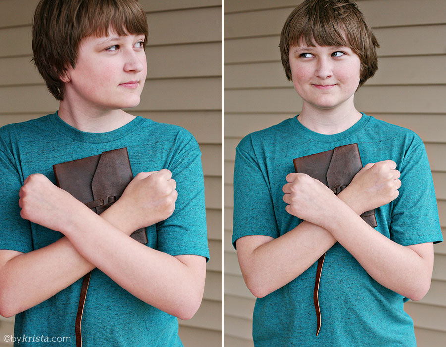
Once I loaded the images and took a look at them, I knew it had to be the blue shirt. It looked much better with his skin tone and it just popped. Plus, I love that color.
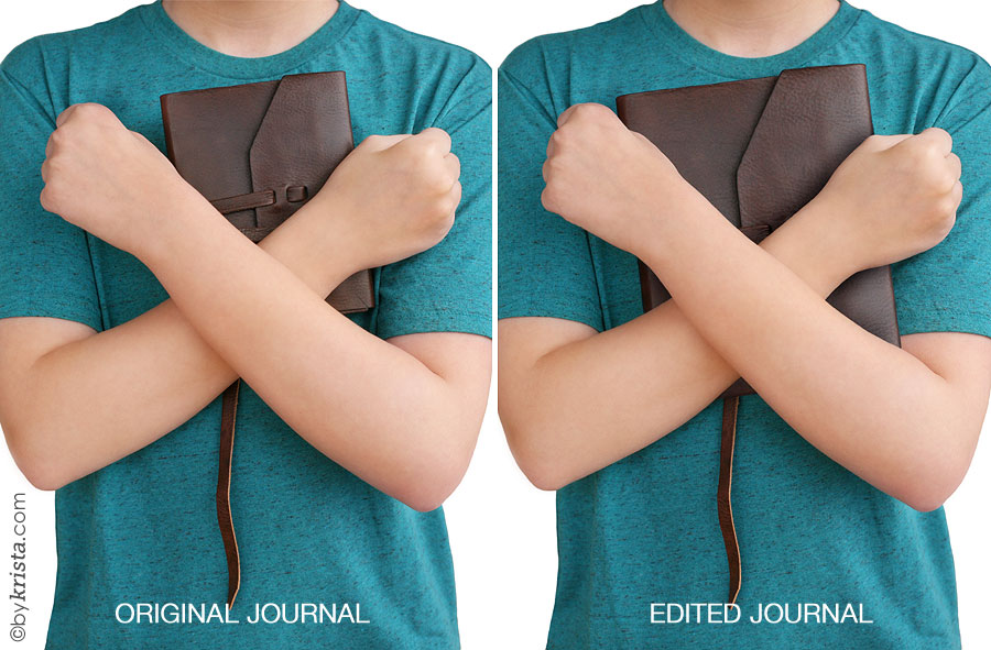
Another thing I knew … the journal was too small. While writing the book, I always envisioned Drew’s notebook to be larger, like 8×10 or something closer to those dimensions, but the only one we could find that looked similar to my imaginings was this small one from B&N. And I didn’t want to drop a small fortune on a larger one and didn’t really like the styles, so I went with it. I knew that I had the photoshop skills to alter the size of the notebook, thanks again to all my years of editing wedding photographs (I have literally swapped heads from one photo to another to make sure everyone’s smiling in family and bridal party photos.) 😉
You might also notice that the backdrop is the siding of my parents’ house. I erased the background to make that white, then went about resizing the journal. I will not explain all the many steps it took for me to do that. I don’t even remember half of them. I will just say that it took many hours to get it to look just right. 😉
Here is the before and after:
Once that was finished, I used the template that Createspace gives for authors to design their covers and worked on the layout.
I hand wrote Drew’s name on my iPad using the Paper app and sent it to my husband, Jake, who turned it into a vector graphic for me using Adobe Illustrator. (I don’t have the program and have never used it before, but he does and has, and the letters were nice and smooth-edged when he was done with them.) I love the look of hand written words on covers and, because “Drew” is always writing in his notebook, I thought that would be a nice touch to have his “signature” on the front of the book.
So these were my first two versions. I decided that the blue background was too much, so I went with the white when I ordered my first proof copy. It was just too plain once it was printed. (The big gap at the bottom is the space for the UPC code, by the way.)
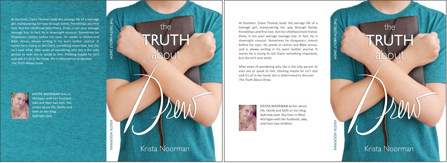
Another thing I noticed was the words “the” and “about” were too light and blended into the background a little too much. So I made those a little bolder and added a darker drop shadow. My name was also not properly centered, so I fixed that. And then I decided to go with a mix of the first two designs and add a gradient to the blue background and I liked that much better. A little bit of color, but not overwhelmingly so.
But still … something was missing. And then I remembered that when I originally doodled the name “Drew” onto my iPad, I liked that the “D” looked like a cross at the top (tying in with the Bible verses Drew is always quoting), but it also looked like the tip of a pen at the bottom. So I pulled out the iPad again and drew a swirly line to look like the tip of the “pen” had drawn it, and sent it off to Jake for some more vector graphic magic. I dropped it onto my cover design and loved it.
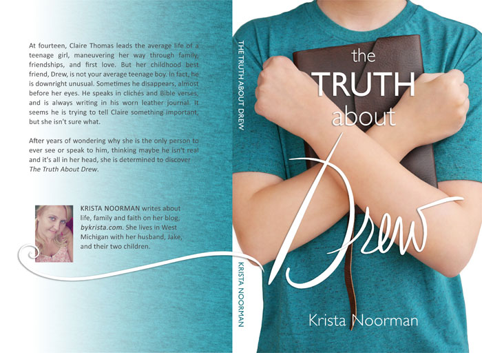
And this is the finished cover for the paperback version of my book! To take an idea from my head and make it a reality is pretty awesome. I’m proud of how it turned out and it looks great in print, too. 🙂
So … I told Zach, who will probably kill me for sharing these, that he didn’t need to smile while I took the cover pictures, because his face would not be seen in the finished product. This is what he did while I was shooting.

What a kid! Thanks, bud, for being my cover model. 😛
Hope you enjoyed this little peek into my cover design process. If you have any questions, don’t hesitate to comment below.
